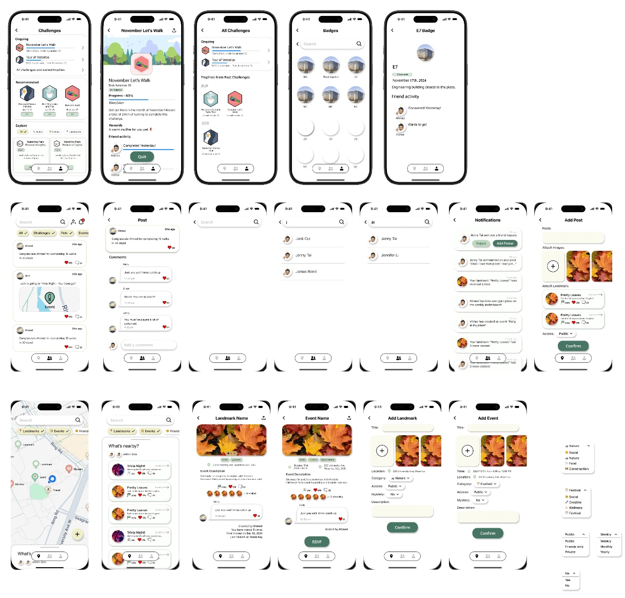
High-Fidelity Prototype
Design Philosophy
Core Message
Motion aims to convey a sense of connectivity, eco-friendliness, and exploration, encouraging active transportation and community engagement.
Visual Identity
- Natural green tones for health and growth
- Creamy yellow for playfulness and optimism
- Circular shapes symbolizing community
- Map gradients emphasizing exploration
Design Principles
- Gestalt Proximity for intuitive grouping
- Von Restorff Effect for key elements
- Spatial Organization for clarity
- Consistent Color Psychology
- Clear Error Visibility
Design Critique Session
After completing our initial high-fidelity prototype, we conducted a comprehensive design critique session with our peers and instructors. This session helped identify key usability issues and areas for improvement across different aspects of our interface. The feedback gathered was instrumental in refining our design for the final iteration.
Route Selection Interface
Key Findings
- Icon meanings unclear, especially scenic landmarks
- CO2 savings data needs context
- Mystery landmark reveal mechanism confusing
Improvements Made
- Added comprehensive icon legend
- Redesigned CO2 indicator with clear context
- Simplified mystery landmark interaction
Visual Consistency
Key Findings
- Inconsistent color schemes across sections
- Pet page background too bright
- Profile page information density issues
Improvements Made
- Standardized color palette application
- Adjusted pet page color correction
- Restructured profile page layout
Evaluation Planning
After implementing our initial round of improvements based on the design critique session, we planned comprehensive heuristic evaluations and cognitive walkthroughs. These evaluation methods were chosen to identify any remaining usability issues and ensure our refined design met user needs effectively.
Heuristic Evaluation Focus
Aesthetic and Minimalist Design
Ensure clean interface focusing on core features of active transport and social connection
Recognition Rather Than Recall
Verify intuitive recognition of navigation and social features
User Control and Freedom
Confirm easy navigation and clear exit points throughout the app
Error Prevention
Validate robust error handling in route planning and social interactions
Consistency and Standards
Ensure coherent design patterns across all features
Cognitive Walkthrough Tasks
Route Navigation to E7
- Search for destination
- Select route preferences
- Start navigation
- Add landmark during route
- Complete journey
Adding a New Friend
- Access social features
- Search for friend
- View profile
- Send friend request
- Confirm connection
Challenge Progress Sharing
- Access profile
- View challenges
- Select specific challenge
- Check progress
- Share with friends
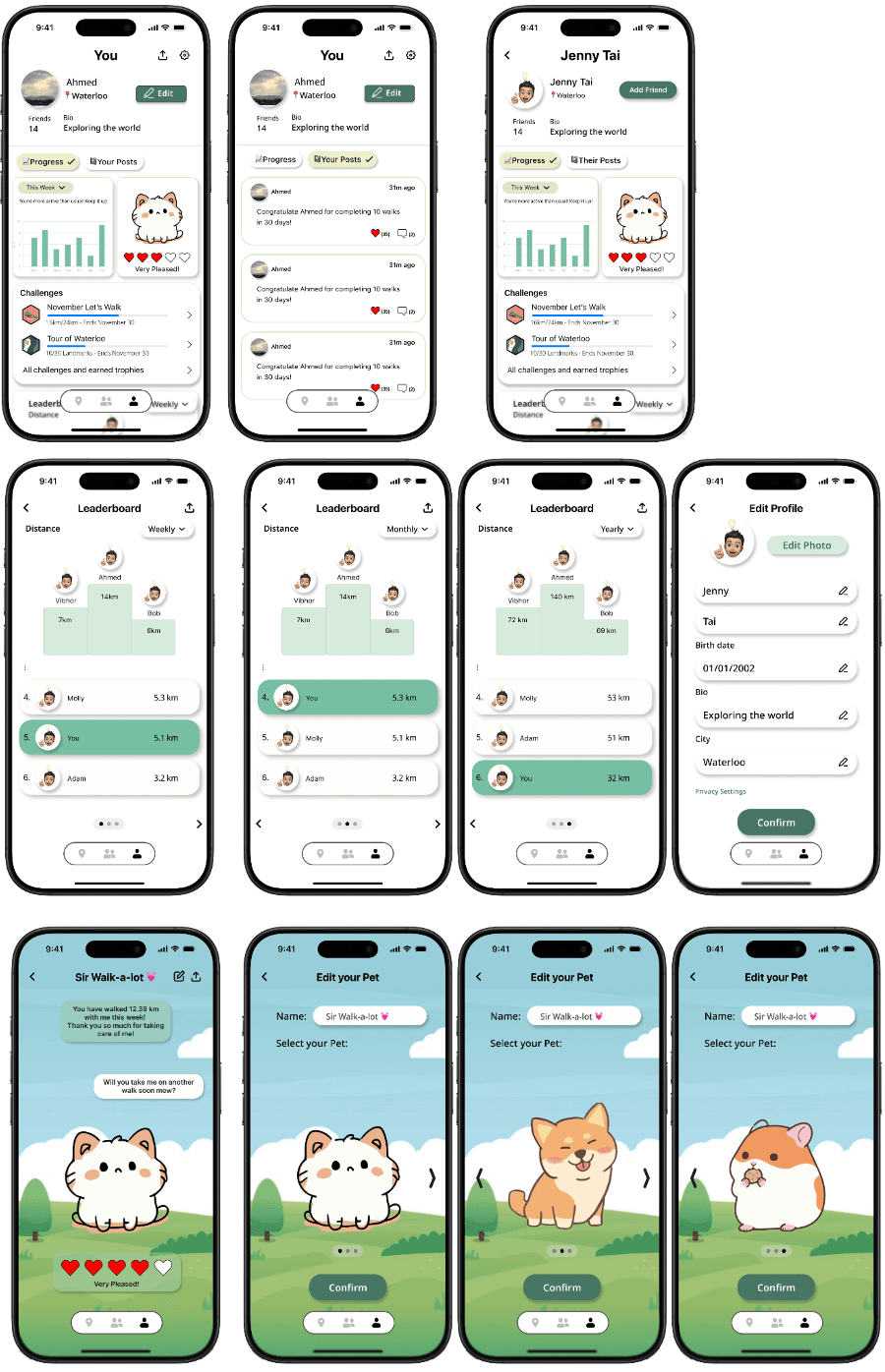
Evaluation Results
Heuristic Evaluation Findings
Confirmation Actions
Added confirmation pop-ups for important actions to prevent accidental interactions and increase user control. This includes friend requests, navigation endings, post creation, and sharing features. Users reported feeling more confident in their actions with the added safety net of confirmation dialogs.
Navigation Improvements
Enhanced button sizes and placement for better accessibility and navigation flow. Added missing back buttons and increased tap target sizes for improved usability across different devices and user needs. Special attention was given to one-handed operation scenarios and users with varying levels of motor control.
Activity Feed Redesign
Simplified the activity feed layout by removing drop shadows and chat-like elements, creating a clearer distinction between social updates and conversations. The new design emphasizes chronological order and content hierarchy while maintaining visual consistency with the rest of the application.
Error Prevention Measures
Implemented proactive error prevention through input validation, clear action buttons, and undo functionality. Added tooltips and helper text to guide users through complex interactions and prevent common mistakes in route planning and social features.
Cognitive Walkthrough Results
Successes
- Effective undo and back button implementation across all features
- Clean, minimalist design approach that reduces cognitive load
- Intuitive activity feed engagement with clear social context
- Consistent navigation patterns throughout the application
- Clear feedback for user actions and system status
- Efficient landmark discovery and sharing process
Challenges
- Multiple landmark navigation organization needs improvement
- Inconsistent button styling across different sections
- Activity feed visual confusion with chat interfaces
- Complex gesture interactions need better indicators
- Information hierarchy in profile views needs refinement
- Pet interaction feedback could be more immediate
Planned Improvements
- Implement landmark ordering system with drag-and-drop functionality
- Standardize button design patterns across the entire application
- Refine activity feed visual hierarchy and interaction patterns
- Add confirmation dialogs for critical actions with clear consequences
- Enhance gesture discovery through subtle visual cues
- Improve immediate feedback for pet interactions and achievements
- Implement progressive disclosure for complex features
High-Fidelity Prototype Iterations
Initial High-Fidelity Design
Our initial high-fidelity prototype incorporated the core features and design elements from our low-fidelity testing, with refined visual design and interaction patterns.
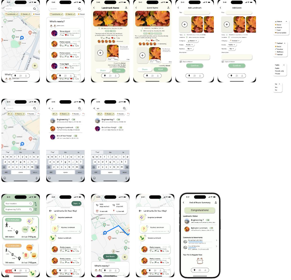
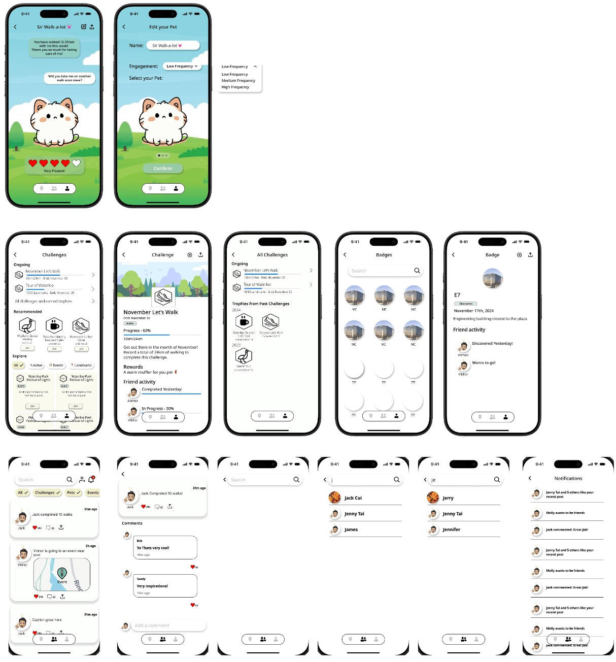
Key Features
- Basic route planning with landmark discovery
- Initial social feed implementation
- Simple pet interaction system
- Core navigation structure
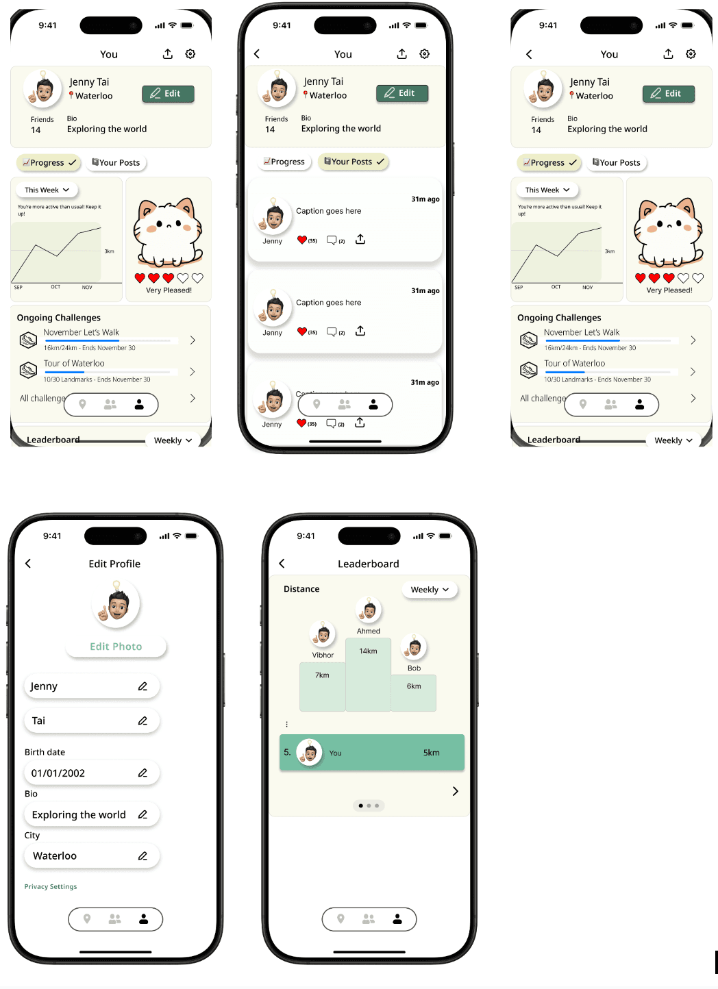
Refined High-Fidelity Design
Following our evaluation phase, we implemented significant improvements based on user feedback and heuristic evaluation findings. Through a combination of design critique sessions, heuristic evaluations, cognitive walkthroughs, and prototype evaluation interviews, we iteratively refined our design to create a more intuitive and user-friendly final prototype that better serves our target users' needs.
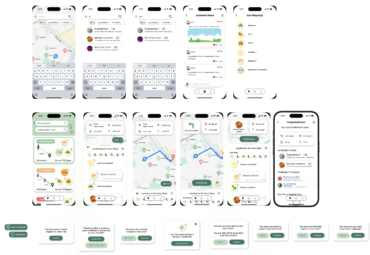
Key Improvements
- Enhanced confirmation dialogs for critical actions
- Redesigned activity feed with clear visual hierarchy
- Improved navigation with larger touch targets
- Standardized button styling across all screens
- Added progressive disclosure for complex features
- Implemented drag-and-drop landmark ordering
Made while petting a virtual cat 🐱
© 2024 Motion